Website Accessibility and SEO
Mutually Beneficial for Your Website and Your Business
by Sammi Dittloff | October 31, 2019
Website accessibility and SEO have more in common than you may think. While website accessibility is a mandate under the Americans With Disabilities Act, changing your website so that more people can use it also has clear SEO benefits. We detail four things you may already be doing for SEO that will help improve your site’s accessibility, as well as four things you should think about doing if you’re not already. Plus, we’ll share five changes that help make your site more accessible, as well as some resources you might want to look into.
Why should you care about accessibility?
Website accessibility is an important issue, both for legal reasons and business reasons. Most websites are not likely to hold up to any ADA compliance checklist featured online. If your site isn’t ADA-compliant, you are leaving yourself open to lawsuits. There were 181% more lawsuits documented in 2018 versus 2017. However, a fear of lawsuits shouldn’t be the only thing driving you to make your website more accessible. Think about the business you can gain by making it easier for people to access your information.
One billion people have disabilities. The majority of these disabilities are not visible. They can be permanent, temporary, or situational, and involve any one of the senses. If you aren’t considering the ways you can make your website more accessible for a wide range of disabilities, you are closing the door on one out of every five people. Wouldn’t you want to get business from 20% of people who may not have been able to access your website before?
4 SEO practices you may already be doing that will improve web accessibility

Using h tags and following content hierarchy
In many cases, website accessibility and good SEO practices go hand in hand. One of the pieces of advice we’ve given you on winning featured snippets is to structure your h tags, the HTML tags you use for headers, in a logical order. This not only helps search engines crawl your site, but it also helps people using assistive technologies to scan your site in an organized fashion. Not to mention, it helps your sighted readers scan your content for what is most relevant to them.
Using schema markup to help add organization and context to your content
Schema markup provides additional context around content. It helps search engines identify how to organize pieces of content, and what to serve up for certain types of searches. Schema markup is an essential part of your SEO strategy (you can even write an entire eBook on the topic - and we did!), but the bonus is that it helps add context to your site that can make it more accessible, too!
Making sure all PDFs and presentations on the site have readable text
Sometimes when you save a document as a PDF, all the text present in the document may not be able to be read by assistive technology. Make sure your text isn’t being saved as an image. Adobe Acrobat Pro is one tool that can help you make and check documents for accessibility.
Using alt text for images on posts, as well as images and charts in documents
Alt text is used to add more context around an image you have on your site. This HTML tag helps describe what the image is, and can also incorporate your target keyword to help with SEO.
When you are creating your alt text, think about how you would describe it to someone so they can visualize exactly what the image is. Use that to create your alt text. Don’t forget about charts or images on files hosted on your site as well. Alt text isn’t necessary for images that are purely decorative, but in general, err on the side of adding something in that field. If you’re looking for ideas, Deque has some useful guidelines for creating alt text.
4 SEO practices you may not be doing yet, but should consider

Using keyword-optimized filenames on PDFs and PowerPoint documents
We think about using keyword-optimized titles on our posts, but with files, it’s easy to get a little lazy. You may just let the name of your file be whatever it was when you uploaded it, but take the time instead to choose an SEO-friendly filename. For example, if you were sharing a price guide for your latest widgets, you may name the file something like “2019-widgets-price-guide.pdf.”
Using clear and descriptive link text
Say you’re writing a post about cold brew coffee. Would you add a link to text that says “click here”, or would you link on the words, “cold brew coffee”? Make your link text descriptive wherever possible, and unique to what you’re linking to, and it can help people who can’t see the page scan links quicker. You’re also following SEO best practices by doing it! For “read more” links after blog excerpts, you can use an aria-label to add more description. ARIA label attributes can be added where more context might be needed for someone who can’t see the screen, like adding “close” to an X in a pop-up. ARIA labels can also be used to override any other labels that may be on HTML by default, like being shown over button text.
Observing how your site works with keyboard-only navigation
How would your site be navigated by someone who was only using a keyboard to tab around? Would all elements that can be interacted with be available to them? Would anything show up as interactive that wasn’t? Would the order they navigate through the site make logical sense? These are the questions you should try to answer as you test keyboard-only navigation. Websites that read in a logical order for all visitors are likely to be received as more relevant and useful from these visitors, which can only help your rankings.
Making buttons with text and not just images
Assistive technology needs to be able to read your buttons so the visitor knows what you’re asking them to do. Relevant buttons are especially important on landing pages where you’re looking to get a boost from organic traffic on CTA (call-to-action) buttons, so making sure they can be read and used by all visitors is vital.
Other web accessibility practices you may want to consider

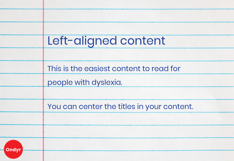
Using left-aligned content
Left-aligned content works better for visitors with dyslexia, who can get thrown off otherwise. You can, however, center or left-align headlines. Because it’s a short amount of text, it isn’t a struggle to read the same way several lines of text would be.
Using all caps sparingly
All caps can also be an issue for readability. If you want to use all caps for emphasis, be sure to use it sparingly. People can get fatigued if they have to read more than a few words in all caps.
Using the most accessible fonts frequently
Using fonts that are easy to read is a helpful practice for anyone who visits your site. Generally, the most accessible fonts are sans serif. Because they don’t include extra embellishment or ornamentation, they are easier for people who are dyslexic or visually impaired to read.
Adding captions, audio descriptions, transcripts, and open/closed captions to your online content
Supplement audiovisual content on your website with descriptions that make it easier for people with different disabilities to still understand it. If you have a video on your website, include captions. If you have a lot of visual elements, make sure you’re describing what people may not be seeing with text or audio. Add transcripts to any audio files or podcasts you host, and videos, especially if they’re not captioned. Also, decide when it makes sense to have open (always on screen) or closed (can be toggled on and off) captions with videos.
Using contrasting colors on your website
The more contrast you have between the background of your site and your text, the better. Black on white or yellow on black are the best options. Tone on tone, like a darker blue background with lighter blue text, is usually a bad idea. Contrast is important for visual impairments, including color blindness.
Resources for website accessibility and SEO
We have barely scratched the surface of all the things you should consider when making your website more accessible and ADA-compliant, but hopefully you’re excited to get started on evaluation and revision, now that you know the great SEO benefits that can go along with it. Here are a few resources you can use to keep moving forward:
The ADA Checklist: Website Compliance Guidelines for 2019 in Plain English by Kris Rivenburgh
axe: Accessibility for development teams - Use this to test the accessibility of your website
UserWay - Web accessibility widget
The idea for this article came from attending “Accessible Marketing is Modern Marketing” at Inbound 2019, led by Christi Olson at Microsoft, as well as research and experience we have gathered over time.
Summary of best practices for web accessibility and SEO
One billion people have disabilities, most of which are not visible.
You are closing the door to one-fifth of your business if you don’t make your website accessible.
Use h tags and abide by content hierarchy to make it easy for visitors to follow your content in a logical order.
Schema markup can add context and organization to your content.
All text in files hosted on your site should be readable.
Use alt text for all images, except for decorative, on your site, as well as images and charts in files.
Use keyword-optimized filenames on your uploads.
Use clear and descriptive anchor text. People should know what they are about to visit by the text that is being linked.
Test drive how your site works via keyboard-only navigation to make sure visitors accessing it this way aren’t missing anything.
Buttons should not just be images - the text on these should also be readable.
Left-aligned content works better for readers with dyslexia.
Use all caps sparingly in your content - it can fatigue your readers.
Sans serif fonts are the most accessible. Use them the most often for easy readability.
Think about how to make your videos accessible to people who can’t see them, your audio files accessible to people who can’t hear them, etc.
Contrasting colors on your website, like black on white or yellow on black, are easier for people to read versus tone on tone colors.
Further Reading from Ondyr Blog
Comments
People Also Ask: How to Use Google’s Related Questions to Their Fullest Potential
What is People Also Ask? People Also Ask, also known as related questions, is ...
Comments
What is On-SERP SEO and why is it important?
On-SERP (Search Engine Results Page) SEO is an umbrella term that encompasses every chance ...
Comments
How to Get a Featured Snippet on Google
Getting a Google featured snippet can improve your search presence, bring more traffic to ...
Comments
Trick Out Your Schema Markup for SEO
Trick Out Your SchemaHow to Leverage Schema Markup to Optimize Your Search Results, SEO, ...
Comments
Google My Business Optimization Guide for SEO
How to Completely Optimize your Google My Business ListingBy Sammi Dittloff and Stephen Stanczak ...
Comments
Google and Structured Data – What We Learned From Google I/O 2019
June 28, 2019 by Sammi DittloffGoogle now has structured data support for how-tos and ...

